“As you have built it, they will surely come..” This kind of conception may work in the movies but not in the practical life. It does not work for companies with lousy website designs. Most of all, if you have built your website in a wrong way, you are actually letting people go from your hand and creating an easy path for your competitors to grab them.
So you need to figure out the smartest tricks to evaluate the attractiveness and efficiency of your website from several viewpoints. So to get you started, here are top 9 reasons that make clients turn away from a website, often leaving and never looking back to it. So let’s discuss!
1. Poor website design
The first and foremost reason why people leave a website is just because of its boring nature and design, in short bad website user experience. There are times, when people just focus on the visual graphics and content apart from the actual website design part. So there should be user friendly interface and easy navigation.
Apart from that, broken links and meaningless applications on the website may put off your visitors. So to make customers stay on your website, and enhance customer experience, try to develop and maintain an attractive and easy to use website.
2. Sites that don’t engage with visitors
Good web user experience is a very important factor in any website. Website visitors may come to your website and need some assistance, but that time if you are unable to provide so instantly they will be frustrated which may lead to website abandonment.
As per a study named “Making Proactive Chat Work” conducted by Forrester Research
“Many online consumers want help from a live person while they are shopping online; in fact, 44% of online consumers say that having questions answered by a live person while in the middle of an online purchase is one of the most important features a Website can offer.”
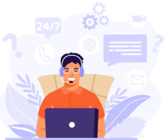
So with live chat, you can directly engage with your customers proactively and offer instant assistance much before they think about it. Apart from that, you can also know your visitor by his country, IP address, geographic location, past visits and many more. Live chat facilitates online engagement to provide better customer service and boost sales conversions.
3. Poor language and unorganized content
These days, content is undoubtedly the most important part of a website. So before uploading content, always keep some of the factors in mind:
‘Is the content grammatically correct?’
‘Are the statistics provided there are accurate and up-to-date?’
‘Is the content well written and easily understandable?’
And finally ‘How is the website user experience?’
Unorganized content also is a big turn-off, especially when the clients are looking for any info. Visual content such as images or videos hold an important part in grabbing customer’s attention and improving the online user experience. So the stronger your content is the lesser will be the rate of website abandonment.
4. Unnecessary pop ups and redirects
Accept it that these pop ups and redirects are really very irritating. Hardly any customer clicks on these pop ups out of interest. But there are loads of websites which have several sign up pop ups or other advertisements related pop ups that not only make website visitors irritated but also force them to leave those websites.
So, if you know that you yourself as a website visitor would never like such pop ups or redirects, then why to put all these on your website? Just think about it and you will get your answer right away!
5. Websites not optimized for mobile devices
Have you ever come across any website which looks good, even from mobile devices? Most of us use smart phones and tablets in our day to day life for internet browsing.
Research shows that, over 17% of all the web traffic are coming from mobile devices specifically and the total no of smart phone users are rising day by day. As per 2012 Google Study, ‘75% of smartphone users prefer using a mobile-friendly site.’ So this data is pointing towards one single view: If your website is not mobile friendly means is not easily navigable from all the mobile devices, you are losing a huge no of customers for your business just because of bad web user experience.
6. Website that takes too long to load
Huge loading time may facilitate to loosing prospect customers. When people come to your website don’t make them wait. If your website takes more than 4 seconds to load, then you should start worrying about it because it’s too long in “Internet Time”.
You may be in love with your website, so it will not bother you, but your website visitors are not. They have come there for making purchases. To enhance customer experience make your website easily accessible to your clients. As time is money, they will wait for just around 6 seconds or so and leave. Optimizing the type and size of images, avoiding unnecessary plugins, redirects, multiple tracking scripts are some of the ways through which you can reduce the loading time of your website.
7. Lack of multi-channel communication option
Traditionally websites used to have one contact no and one email address for any assistance. But today customers wish more. They need instant assistance and don’t want to wait over the phone or for email replies.
With the technological advancements, now it’s possible to have a browser based communication. With such a feature-Click to Call now your customers can directly make audio/video calls to your support agents from the website itself. So always try to have the best and latest communication options available on your website. Because the less multichannel communication options you have on your website, the more your customers will leave you.
8. ‘Contact Us’ page is not available
Another reason why your customers may doubt the authenticity and reputation of your business is the absence of the Contact Us page on the website. It’s very important to provide contact details so that your customers can contact you if required. Several websites only give quick contact form where the customers need to fill up their details with messages and they are told to be contacted soon. All these minute things actually make a whole lot of difference in deciding whether your customer will actually stay on your website or not.
9. Complex checkout process
These days, clients want everything to be really simple and easy. They just do not like wasting time in filling up complicated forms or going through some extra steps for online payments. If the checkout process on your website is very complex and takes huge time, then your customers will simply leave your website being frustrated just because of bad online user experience. So make your checkout process very easy and simple to follow.
For example, in an e commerce website, whenever a customer will go through the checkout process to buy something, she should feel the process really easy and comfortable. Otherwise, you never know, she may leave your website without making any purchase.


